Bringing Harmony and Balance to the Qi Urban wellness centre, Mexico City
As Chinese philosophy teaches, “qiâ€, the circulating life energy, is inherent in all things. The balance of negative and positive is believed to be essential for good health and wellbeing, and this balance and harmony was the essence that Qi Urban, a wellness center, located in the fashion and art district Condesa, in Mexico City, was searching to restore.
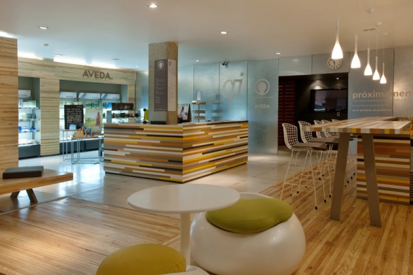
Growing rapidly into one of the largest and best equipped wellness centers in the city, frequented by artists and actors, with multiple services like spa, oxygen bar, full fitness, etc. the owners soon realized that the demand of visitors and vast palette of the services offered required a new Qi welcome area, which would extend the balance and harmony of the center’s inner spaces into the lobby, thus welcoming visitors to the balanced state of mind straight upon their entrance.

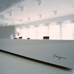
Architectural studio Manadaº planned the new lobby in order to bring balance and harmony in the space, connecting the Hair Salon, the Aveda boutique store, an open kitchen/bar and a welcome reception area.
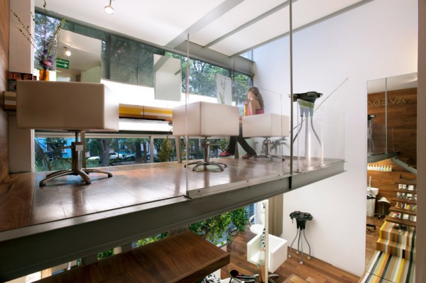
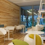
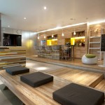
The reception area was placed to the center of a welcome lobby, and thoughtfully surrounded with other functional areas. Hair salon is positioned on a second open level, but divided only with a glass division, so it keeps integrated and feels a part of the space. The open kitchen bar is positioned on a wooden deck, while its design, installation and function make the customers feel comfortable just like at home or at their best friends’.
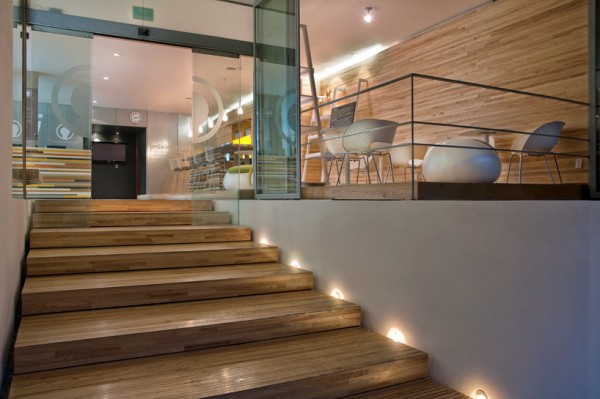
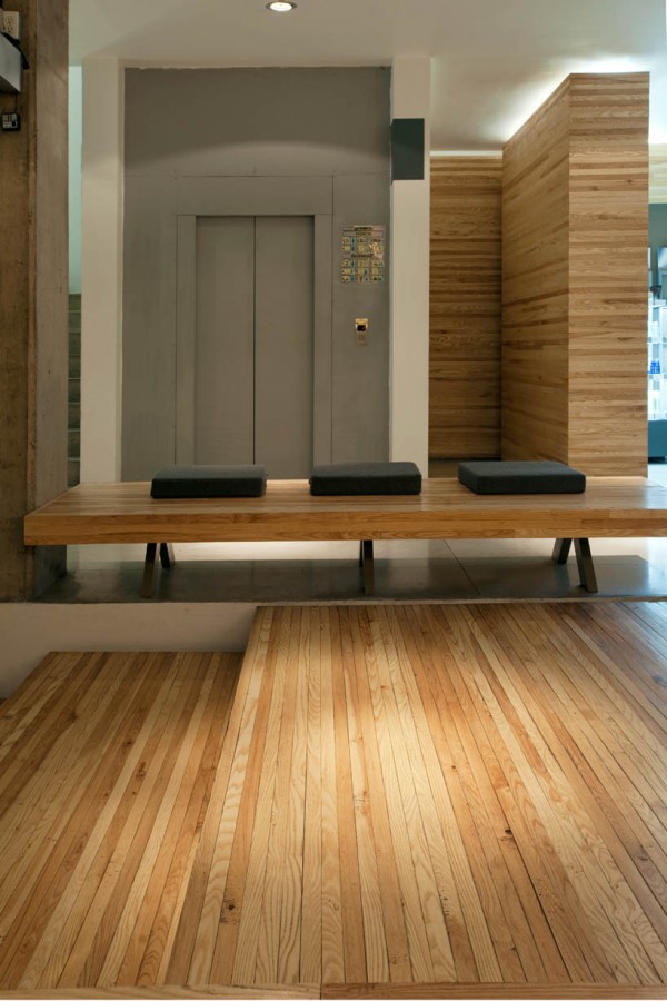
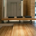
The interiors were manufactured by La Invencible, Mexico City’s furniture manufacturing studio. Manufacture is made out of solid American oak – scrap wood reclaimed from a flooring company, assembled by 1 1/2 inches wood strips. For the main furniture each piece was mapped in order to make construction possible, with each wood strip painted individually in different colors, then constructed on site again. The main part of the manufacture is made of solid ash tree, also assembled by 1 1/2 inches wood strips.
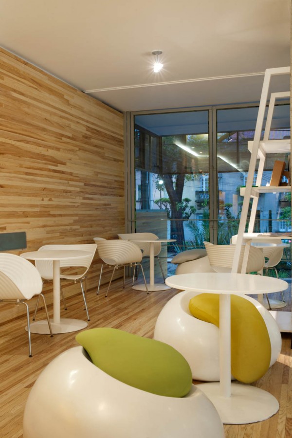
The extension of the wooden deck opens to the front facade, converting the space into a semi open terrace, thus blending the limits of internal space with external. The natural light, balanced colored tones, consisting of natural wood and earthly colors, and the orientation and functionality of the space helped reach a new level of connection and communication with customers, and enabled the harmonious floating of energy through the lobby and interconnection with the inner areas of the wellness center.
PHOTOS: Jaime Navarro
Disclaimer: LA76 is a media relations company for Manada. Contact us for more information.




One Trackback
By LA76 blog » Bed 42 by Manadaº Wins the Interior Innovation Award 2012 February 3, 2012 at 8:35 am