we checked this past weekend some nice packaging:
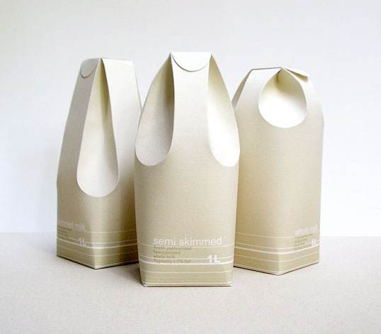
Designed by Raw Edges | Country: United Kingdom
An excellent example of structural package design applied in a functional and communicative way.
“These three different milk cartons distinguish between the rates of fat in the milk by using form rather than colour. The form of the milk cartons reflects in a way on the milk’s texture and smoothness. The two back folds are used as the carton’s handle, while the two in the front function as the spout.â€
—
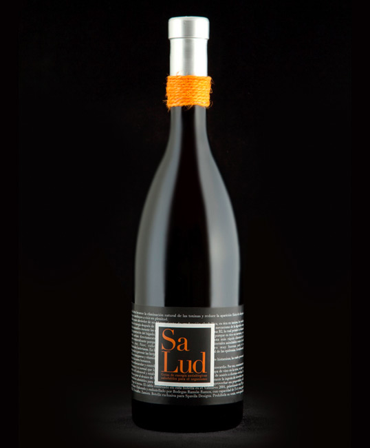
Designed by Spavilla Designs | Country: Spain
“Health is the promotional wine from Spavilla Designs. An elaborate packaging for this limited edition, which the prestigious Robert Parker has given a rating of 93 points.â€
—
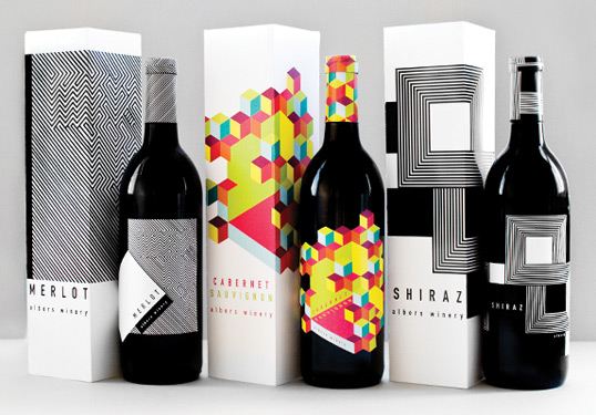
Designed by Meeta Panesar | Country: United States
“The design is inspired by the colors and designs of Joseph Albers and the Op Art movement. The usage of the rectangular elements reflects Alber’s “Homage to the Square,†a series of paintings begun in 1949.â€
—
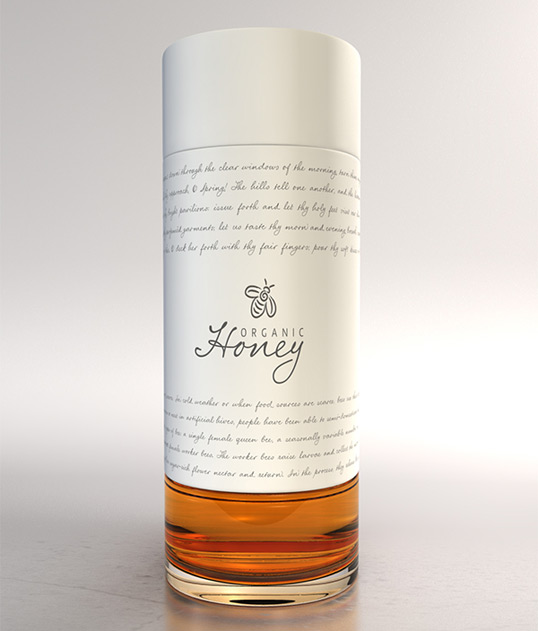
Designed by Marcel Buerkle | Country: South Africa
This elegant, copy driven packaging concept is the work of South African based designer Marcel Buerkle. The shape and cleanliness of the design almost gives it a bit of a high end perfume look and feel.
—
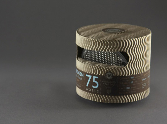
Designed by Mongkol Praneenit | Country: United States
“This is a redesigned for General Electric high-end light bulbs. The package is designed with recycled material to promote sustainability. Information is cleanly organized into a label system to reduce printing over the whole package.â€
—
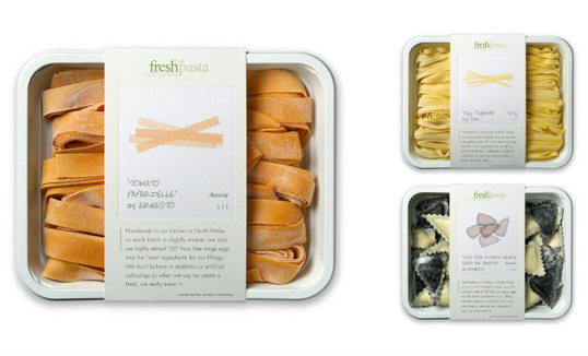
Designed by P&W | Country: United Kingdom
“The brief: Packaging for a company producing high end, handmade fresh pasta. The solution: We created fine art style prints of the pasta shapes, each one signed by ‘the artist’. The result: Improved sales and increased listings with no advertising support.â€
—
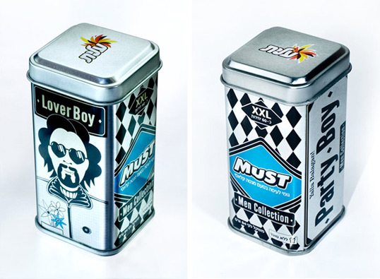
Designed by Oi Design Studio | Country: Israel
“The Brief: When The Strauss group fixed the intention of launching a series of consumer products aimed at men, they requested that we devise a marketing concept for the new products of ‘MUST’, starting with the packaging that will project a strong difference from competitors products on the shelf.
The Solution: ‘Must – Men Collection’ – chewing gum for men only. We chose a collection of illustrated Presenters: male types that we all know and admire – go-getters, women love these men and boys copy them. We put them on metal containers which are especially masculine and gave to each presenter a stage for his male life philosophies.â€
—
all via lovelypackage.com




Hi, Garretot
Hi, blog.la76.com – da best. Keep it going!
Truden